Chesapeake Connections
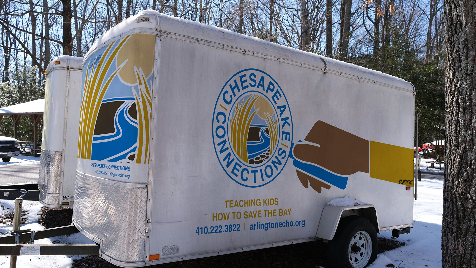
This work was part of a service learning project at Anne Arundel Community College (AACC), where the clients worked with a class to help develop a logo, as well as some artwork for a vehicle wrap. Every student in the class created a separate design, and at the end my design was chosen!
THE BRIEF
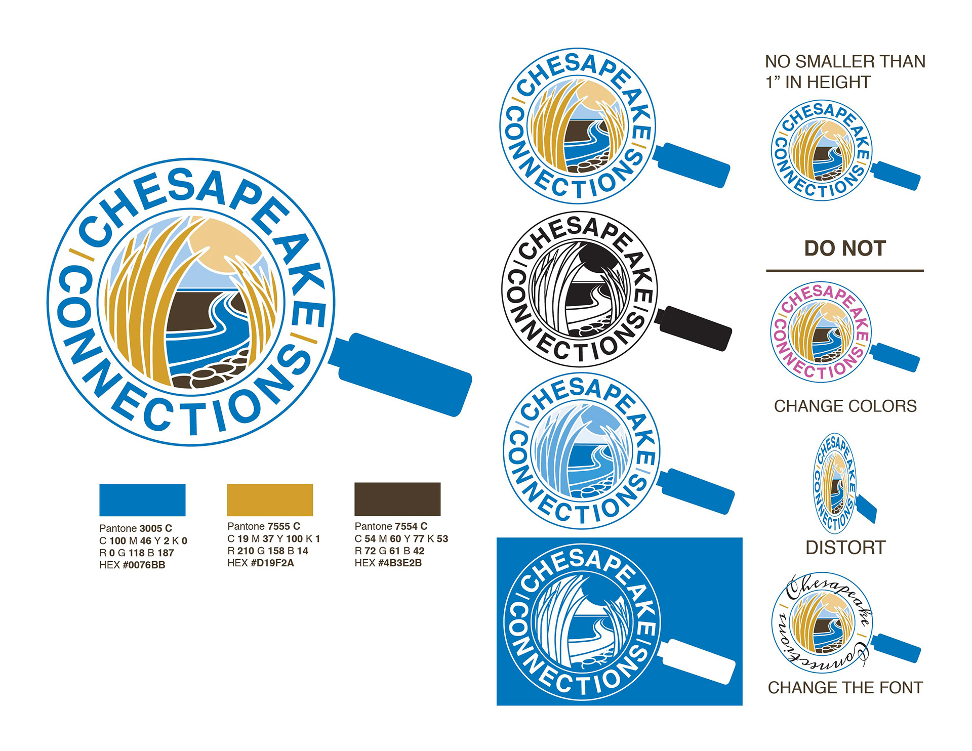
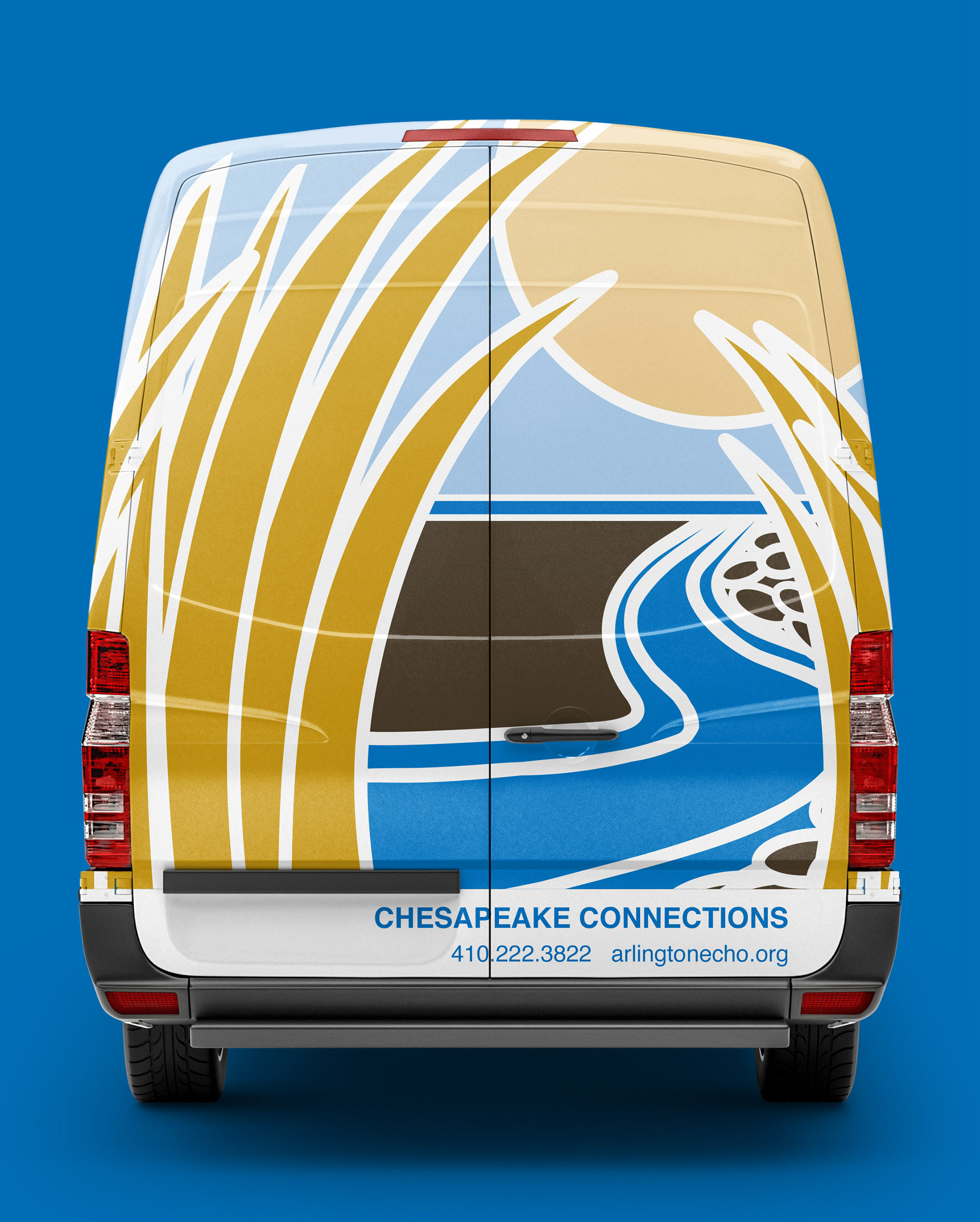
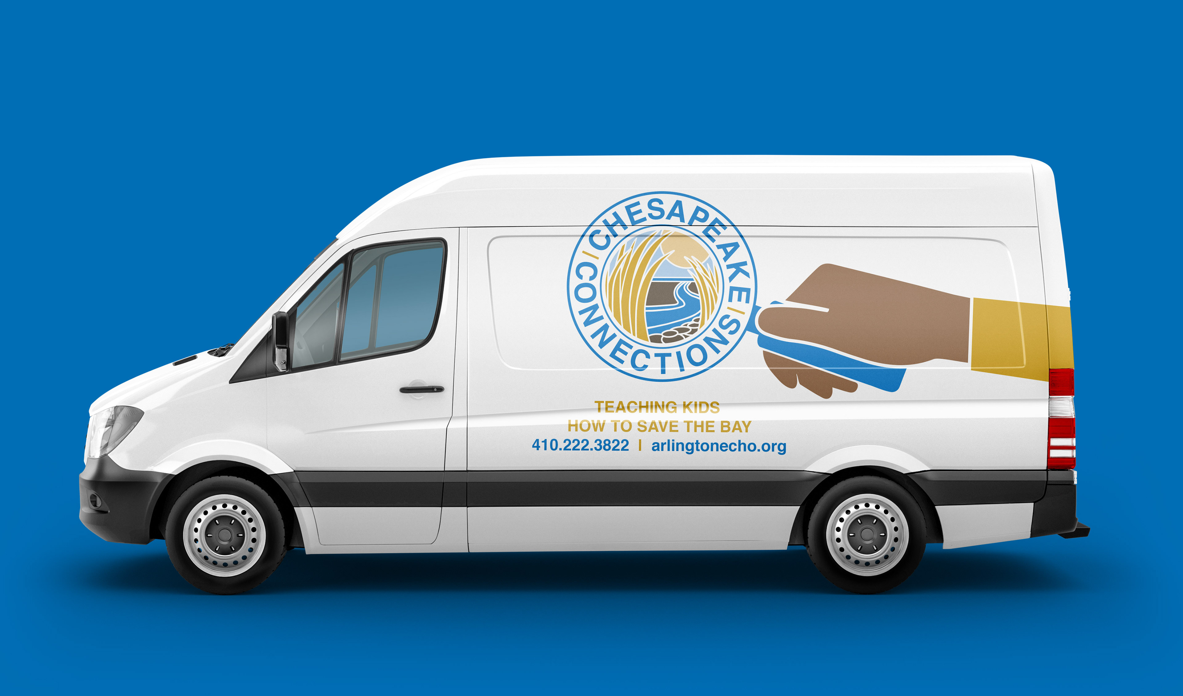
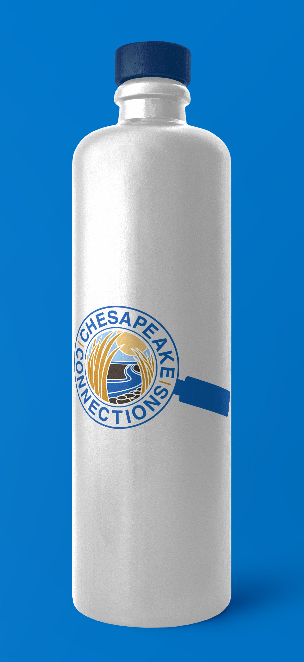
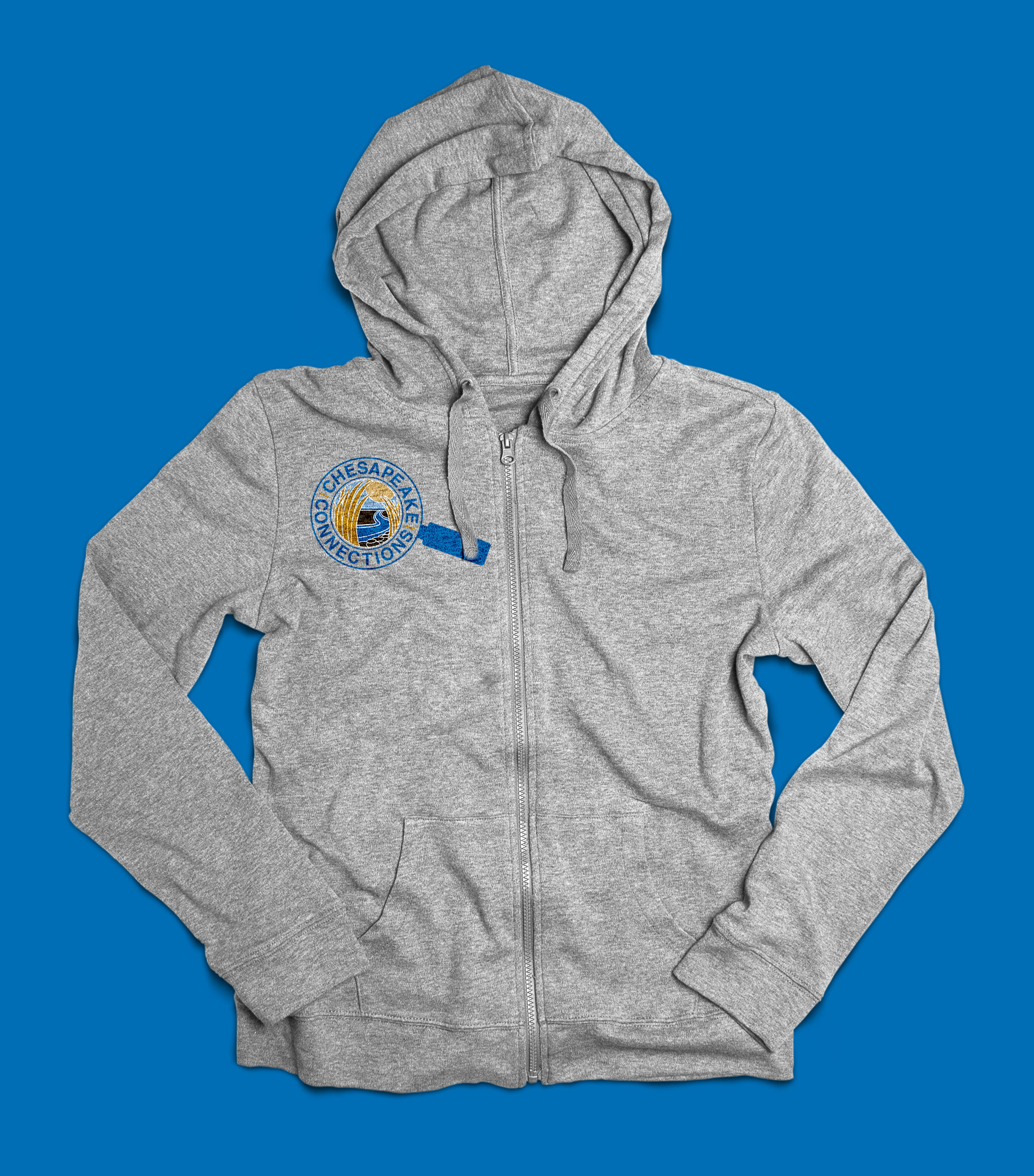
To create a logo and vehicle wrap for Chesapeake Connections that embodied the work they do while also being appealing to their diverse audiences. The logo design was limited to 3 colors and needed to be easily scaleable. The clients intended to use it as small as 1 inch (on permission slips) and as large as multiple feet in height (vehicle wrap).
Chesapeake Connections, a part of Arlington Echo, works to take Anne Arundel County Public School (AACPS) students out of the classroom and into the environment. The client wanted a logo that was kid friendly as well as professional. They primarily work with sixth grade students, but need the logo to also appeal to adults. Sixth grade students pose the unique challenge of not being little kids anymore, but are not quite teenagers either. They do not know where they fit in making appealing to their age group tricky.
THE CHALLENGES
My main challenge was making a design that seemed both professional, “cool” and represented the work they do. This design was my first time trying to appeal to a much younger audience.
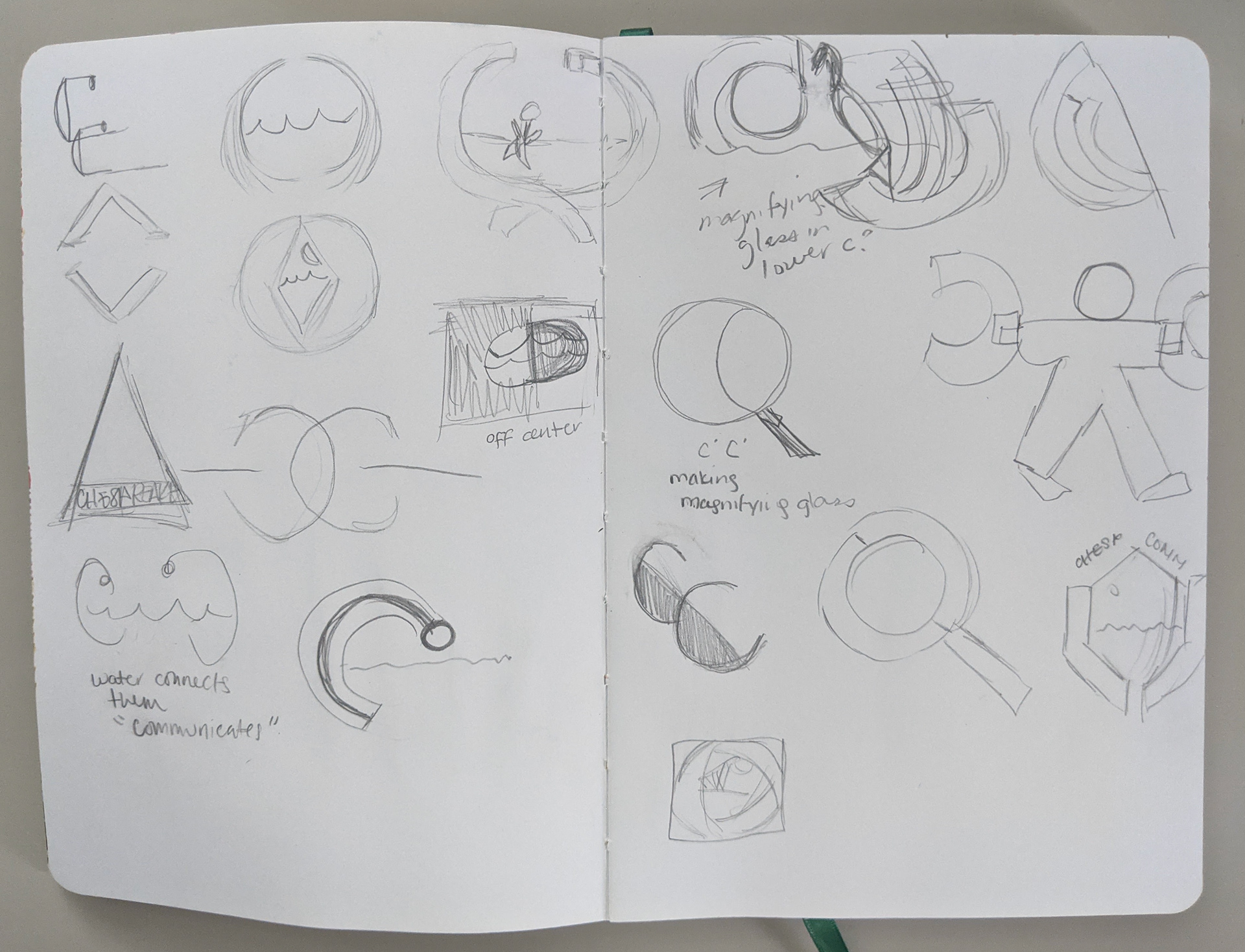
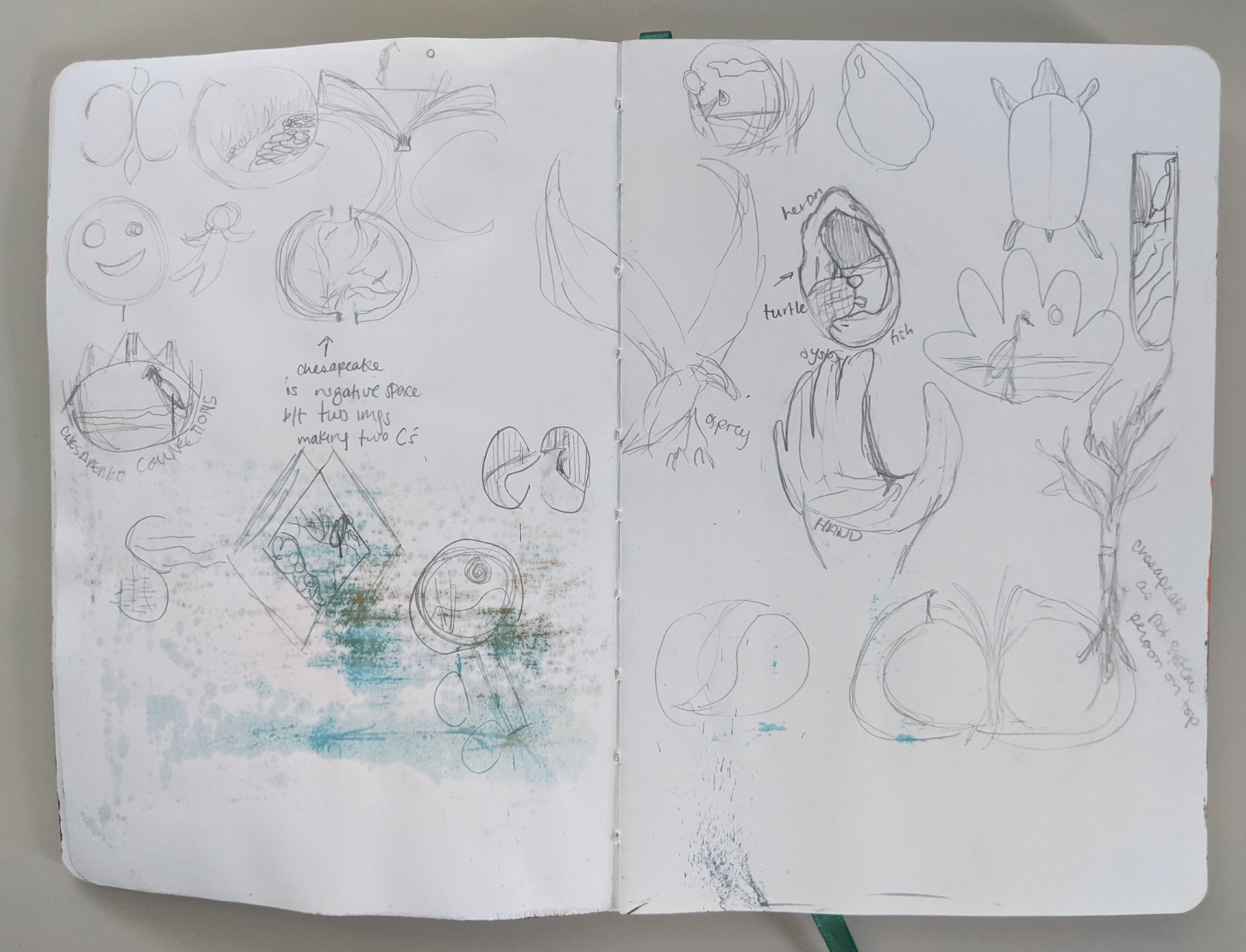
THE PROCESS
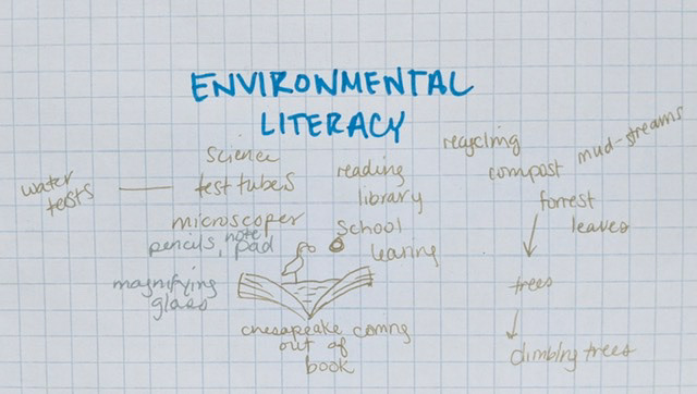
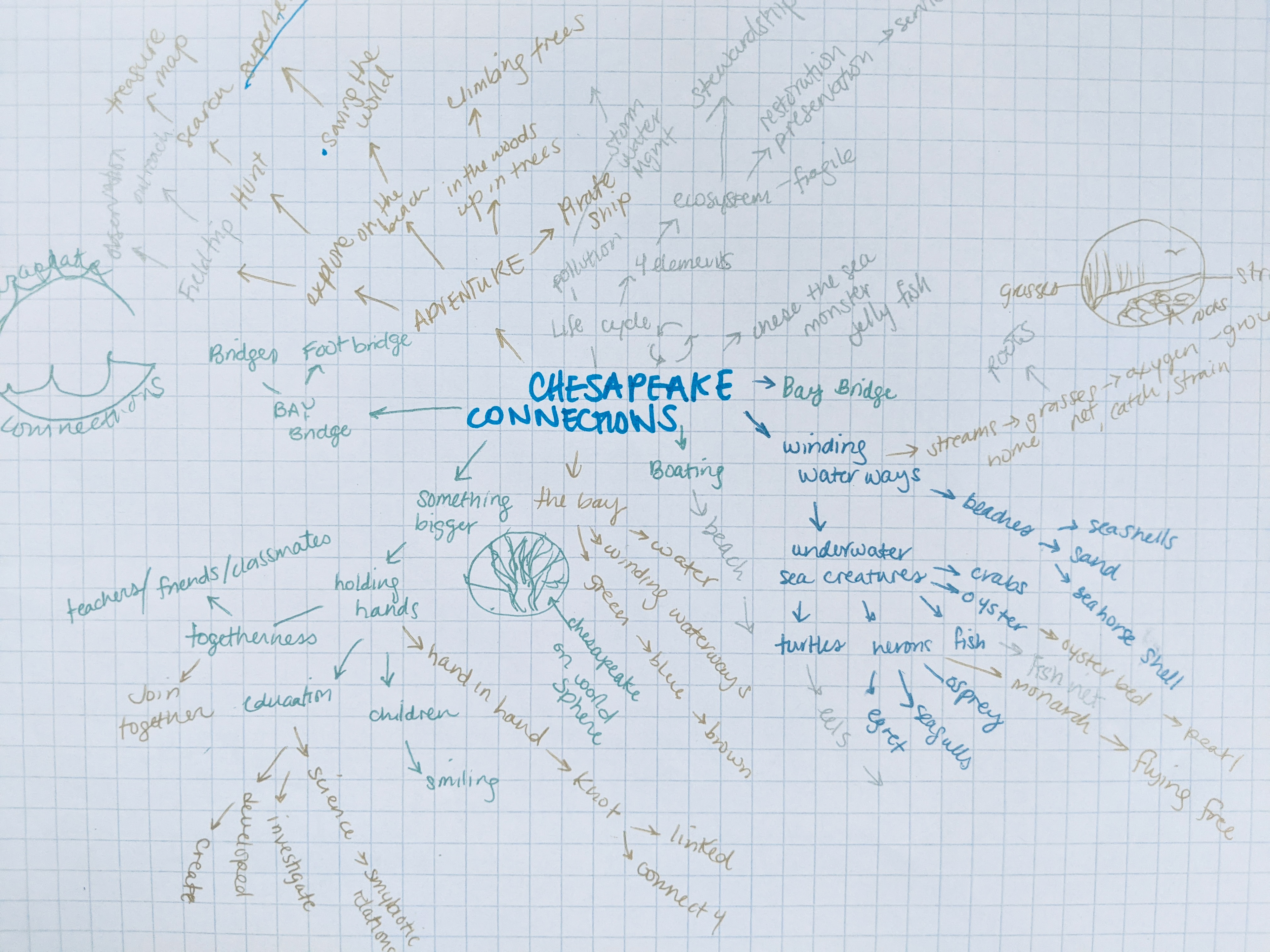
I started with a mindmap to get the brainstorming process underway. I also did some personal research to figure out what a sixth grader wants. Next I created quick sketches of some ideas. I redrew the ones I liked most, and then used these drawings to make roughs in illustrator.
A mindmap for Anne Arundel County Public School's program Chesapeake Connections that focuses on environmental literacy.
A mindmap for Anne Arundel County Public School's program Chesapeake Connections
Rough logo concepts done in pencil.
THE SOLUTION
​​​​​​​The logo I designed is a combination of blue, yellow and brown. The color blue was picked to both symbolize the environment as well as represent the Chesapeake Bay. I wanted the yellow to contrast the blue, be easy to see for those who are colorblind, and to feel bright and friendly. The brown was chosen for its earthy vibes as well as to anchor the other two colors. 
The magnifying glass design looks through to a watershed that leads to the bay. My idea came from videos provided by Chesapeake Connections, which showed the kids out exploring and learning about what is in water.
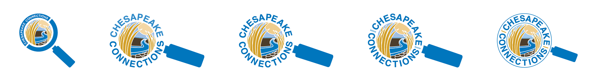
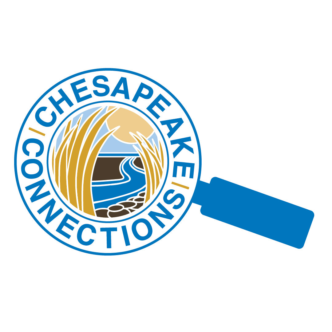
The evolution of the Chesapeake Connections logo. It started out having the entire magnifying glass in blue with white text on top. The second version has the outer edge of the magnifying glass replaced with the text making the edge instead. This text is two tones of blue. The third version has 1 color blue to make the text forming the outer ridge. The fourth version has bars in-between the Chesapeake Connections so that the text is more easily read. The fifth adds a thin line as the out and inner edges of the magnifying glass. The line is blue and goes around the text. The bars placed in-between Chesapeake and Connections is the yellow from the logo.
A Chesapeake connections trailer that has the vehicle wrapper design super imposed onto it.
The back of a white van that has the scene from the Chesapeake Connections logo on it with their name and contact information underneath it. The van is on a blue background.
The side of a white van with the Chesapeake Connections wrapper on it. The wrapper shows a brown hand holding the magnifying glass logo. Underneath of this is text reading "Teaching kids how to save the bay", and their contact information below that. This van sits on a blue background..
A White steel water bottle with a blue lid. In the middle of the water bottle is a Chesapeake Connections logo. The water bottle is in front of a blue background.
A grey kids hoodie sitting on a blue background. The hoodie has the color Chesapeake Connections  logo printed on the upper left side.
Color Logo
Color Logo
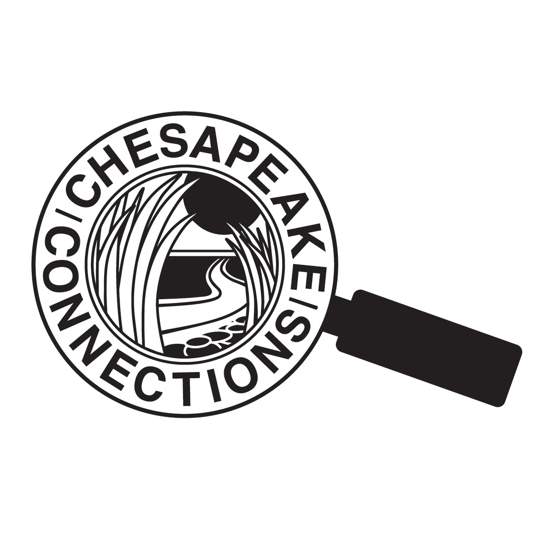
Black and White Logo
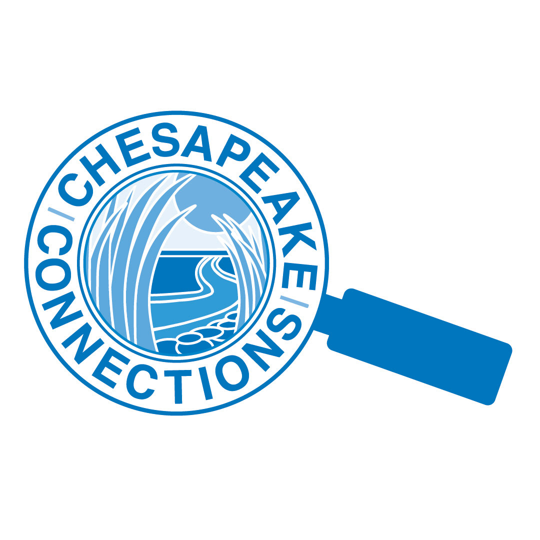
1 Color Logo
1 Color Logo
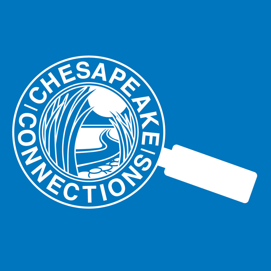
Inverted or Reversed Logo
A logo sheet that shows the colored logo with the pantone colors used to create it as well as their hex value, RGB value and CMYK value. The blue is pantone 3005 C, CMYK is C 100 M 46 Y 2 K 0, the RGB value is R 0 G 118 B 187, and the hex value is #0076BB. The yellow color is Pantone 7555 C, CMYK is C 19 M 37 Y 100 K 1, RGB is R 210 G 158 B 14, and the hex value is #D19F2A. The Brown color is Pantone 7554 C. CMYK is C 54 M 60 Y 77 K 53, RGB is R 72 G 61 B 42 and hex value is #4B3E2B. On the left side there are the four variations of the logos stacked together and then another column showing things not to do with the logo. These "Do Nots" include not making it smaller than 1", not changing the colors, not distorting it, and do not change the typeface..
Back to Top